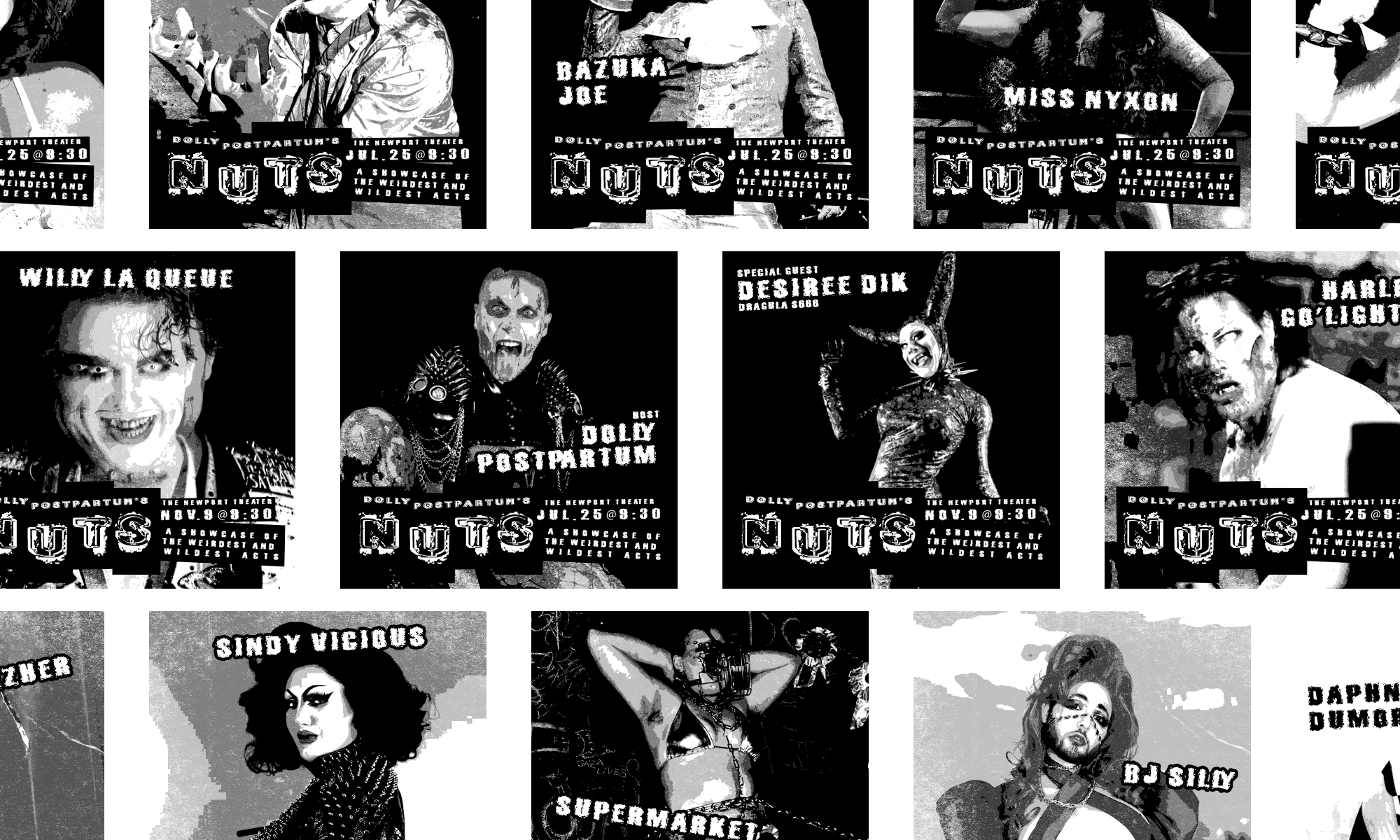
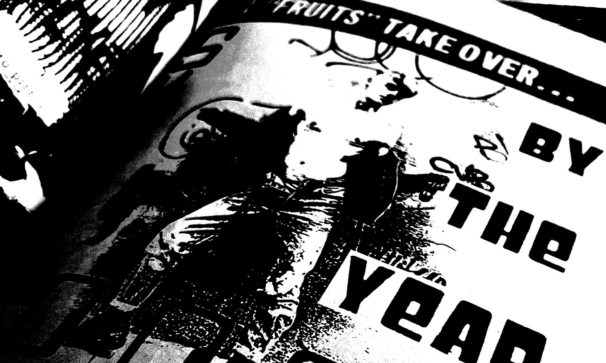
Some performers are too wild for mainstream drag and burlesque shows. That’s why Chicago performer Dolly Postpartum created “NUTS.” A bi-annual show of the weirdest and wildest acts.
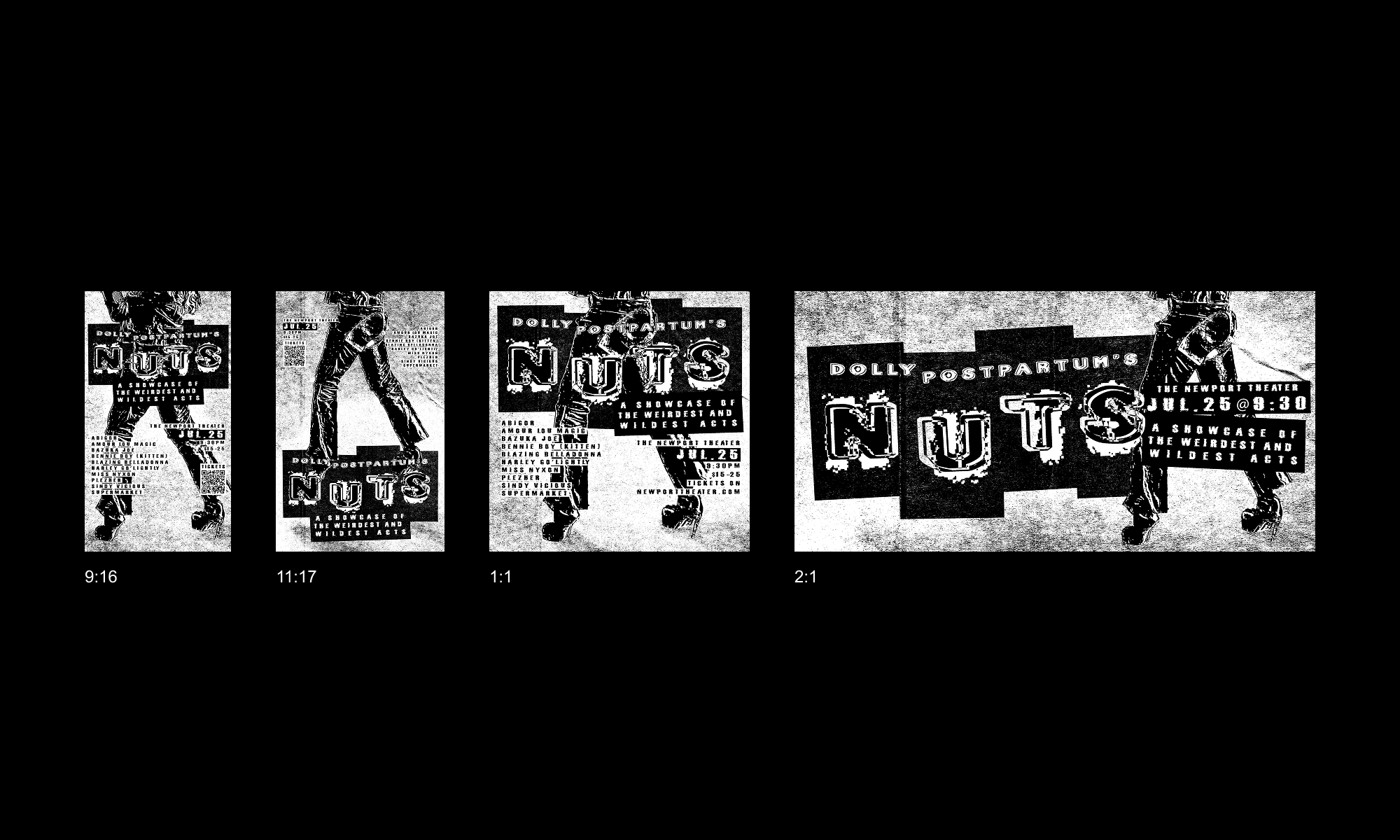
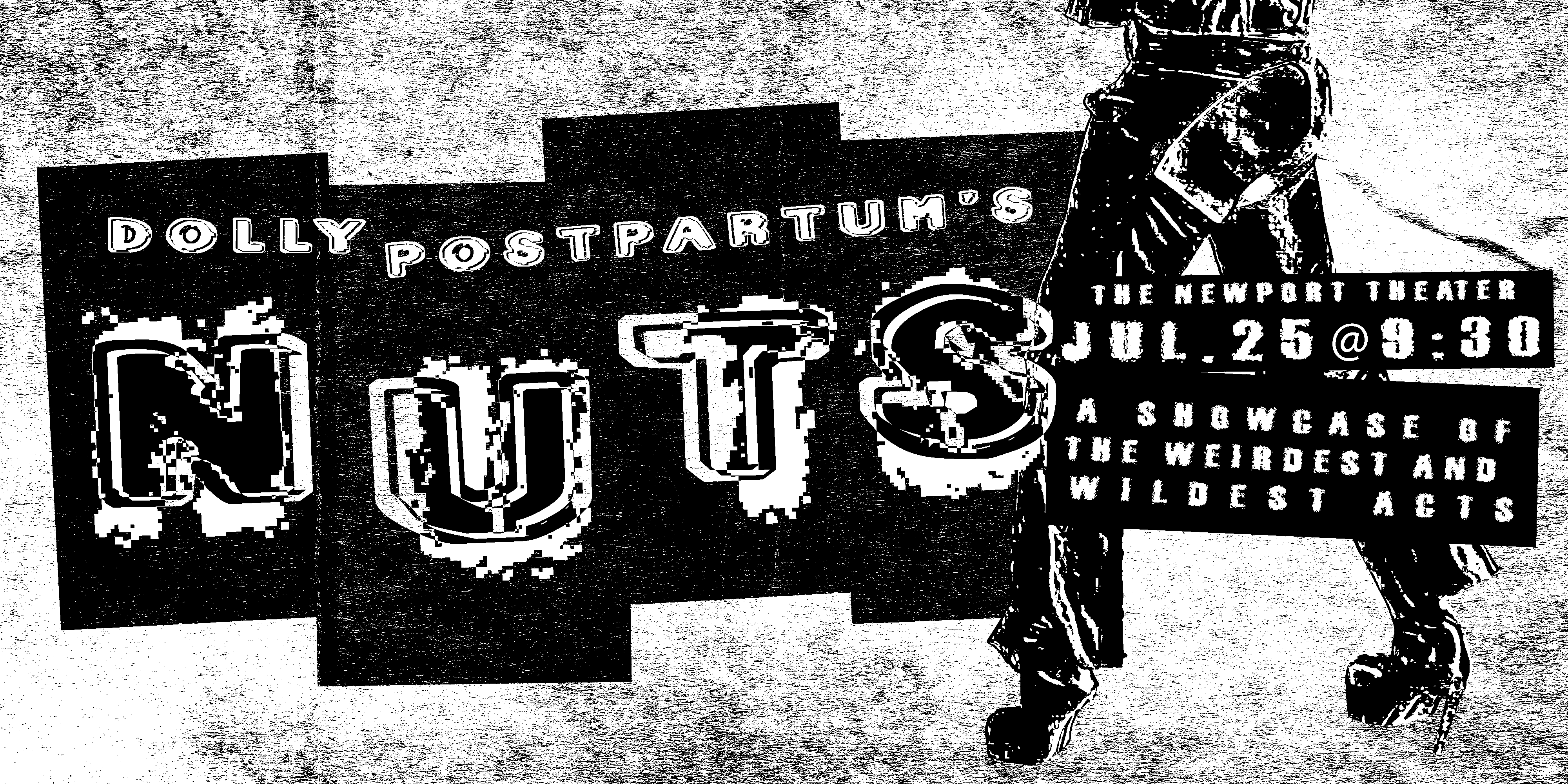
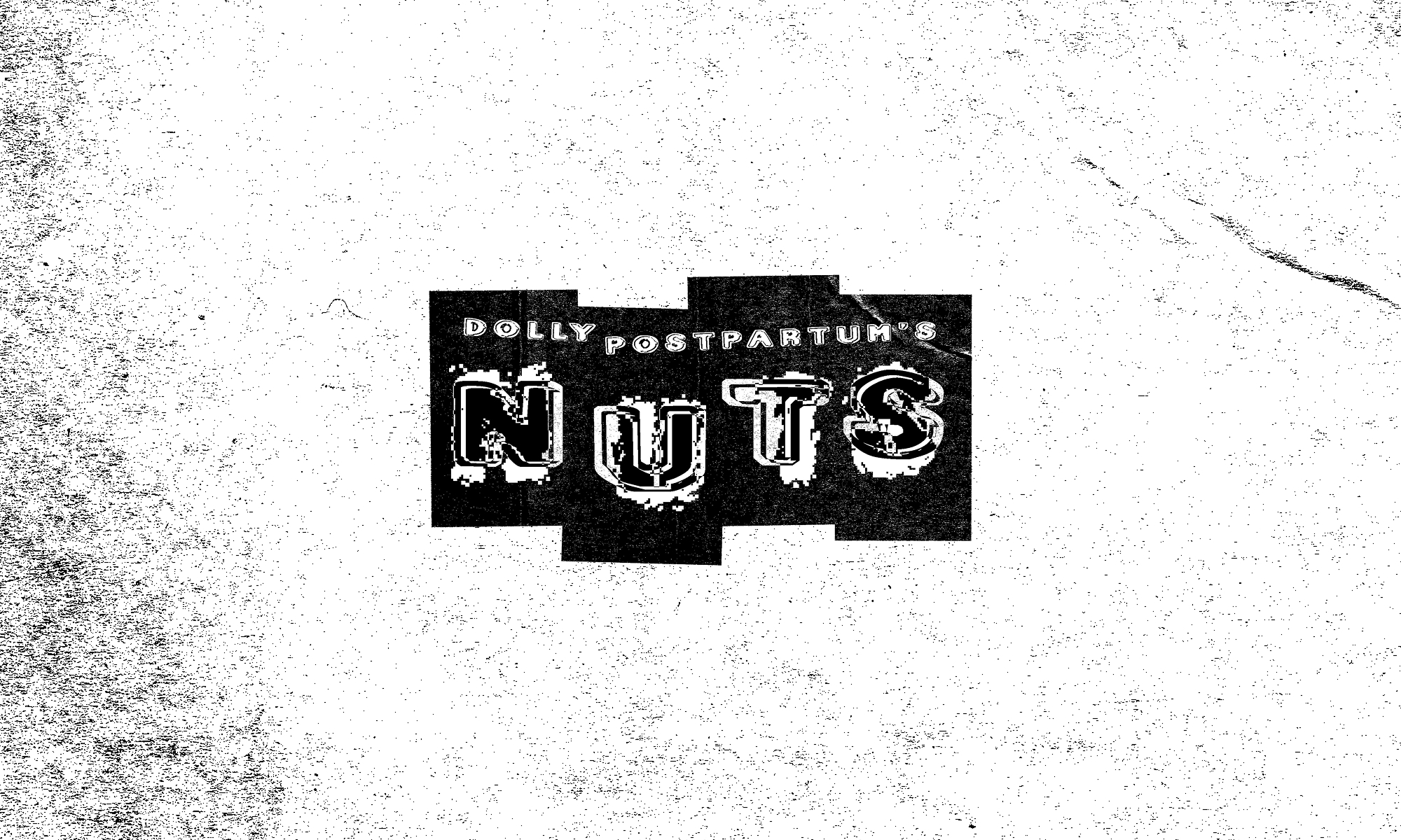
NUTS is a show with needles, butter, and hairballs. So grunge typography, punk zine culture, and crumpled flyers were clear starting points for research. Since NUTS is part of a lineage of alternative performances, it made sense to design with that history and materiality in mind.
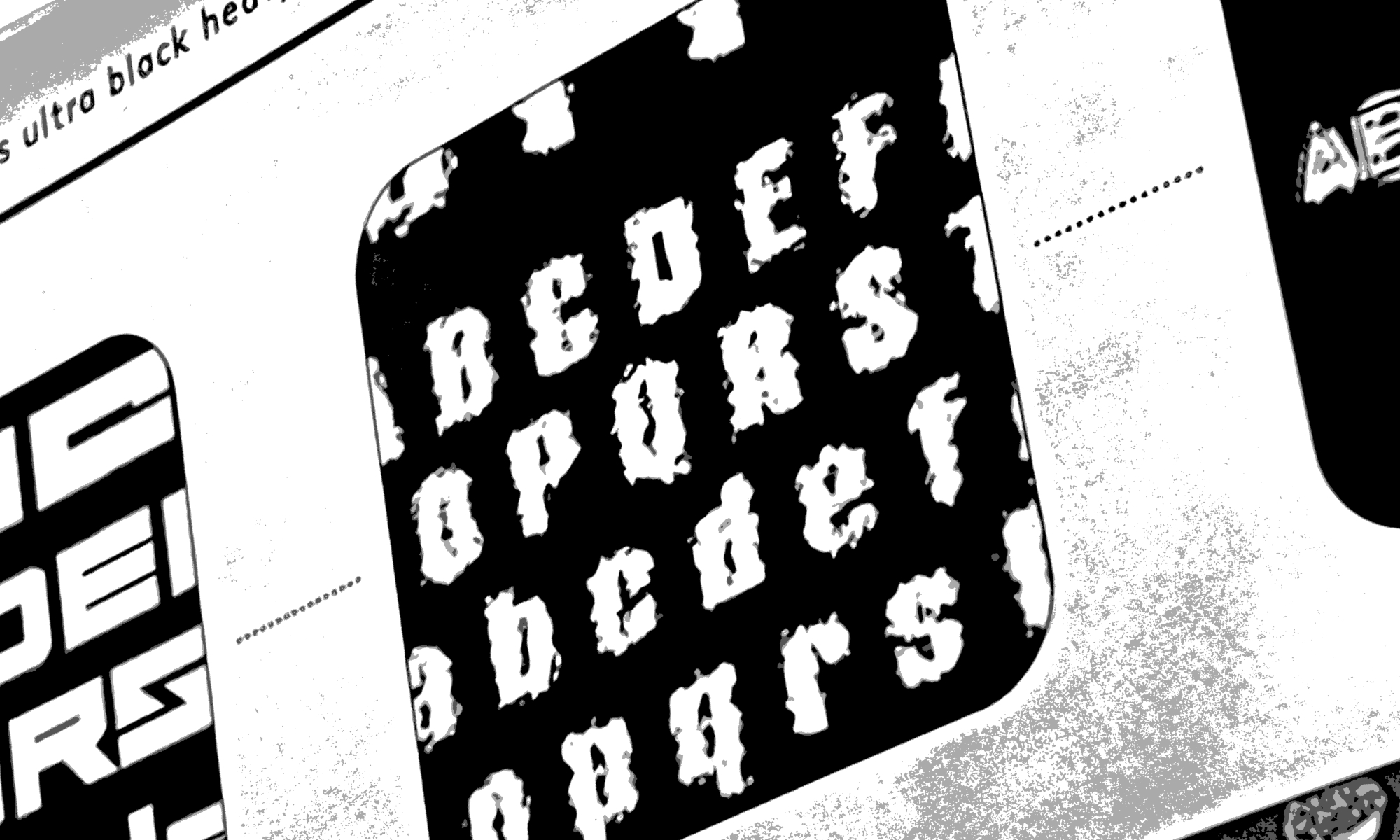
Typography had to honor the wild nature of NUTS while staying functional. We rode the line of legibility. We knew that these images would always be accompanied by a caption, alt text, or other context, which gave us room to be messy without sacrificing accessibility. Ultimately our goal was to convey tone and atmosphere first. These typefaces were pulled from the husks of websites from the 90s and given new life.
The mess was deliberate, but all assets still needed to feel cohesive. Standardized image treatments and multiple layouts made the whole NUTS design ecosystem feel cohesive.