While slop and the wholesale privatization of the open web are pushing design towards the average, New Utensils strives towards work that is highly specific. Brands are a politically complicated force, so the New Utensils brand is high-impact and low-footprint.

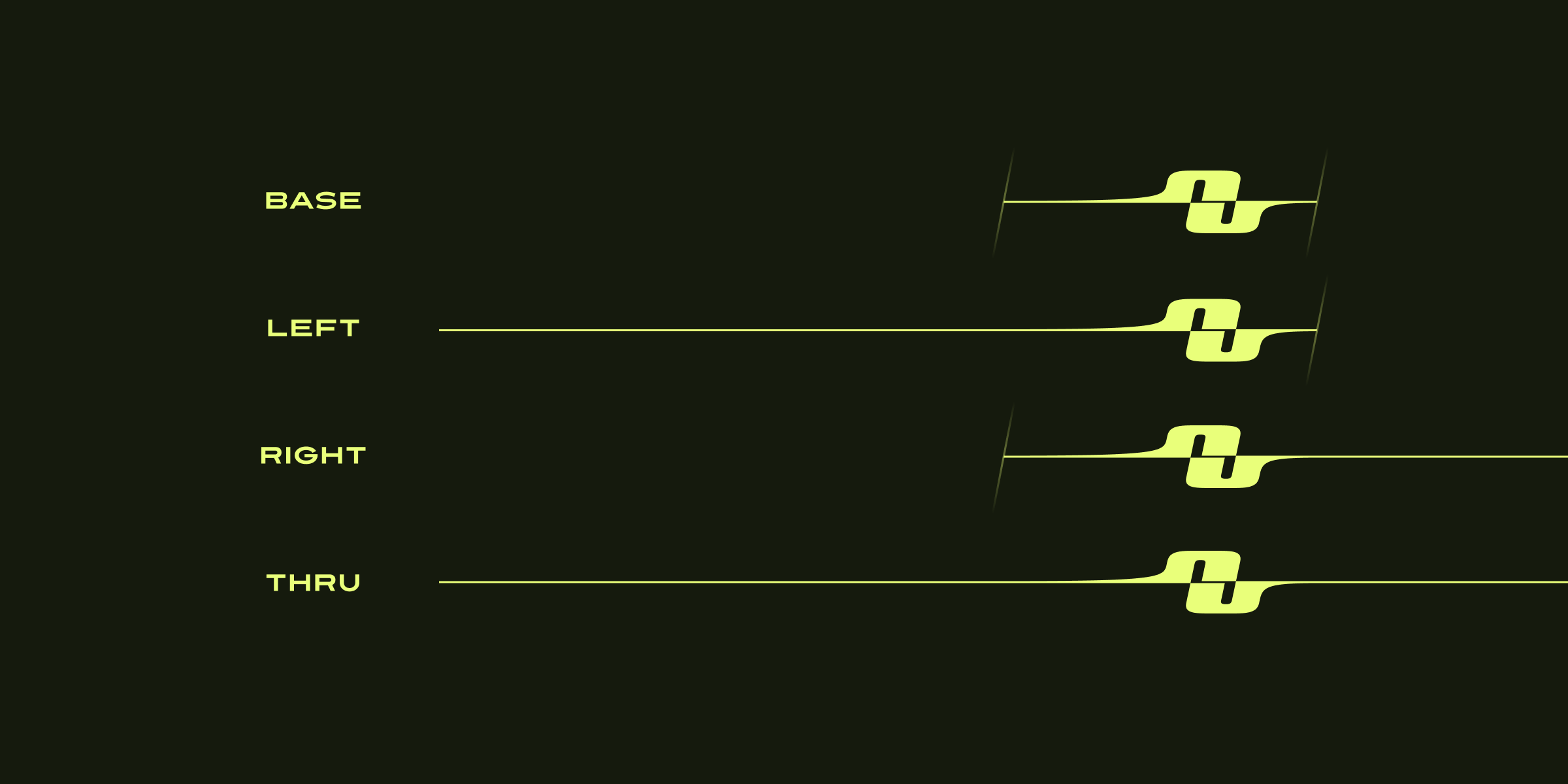
The New Utensils logo, based on “n” and “u” characters from BD Electrobazaar (1995), takes on a decisive, long aspect ratio. While the logo itself is quite bold, a system of different end caps allow for line extensions that help it blend into other design systems.


To reduce branding, New Utensils has very little content of its own. But when it must present itself, it takes on a shimmering GIF aesthetic. Low resolutions and frame rates speak to a time when the web had to be lightweight, compressed, and optimized for slow internet speeds.
In the spirit of making small, impactful statements, the New Utensils color palette is ugly and inaccessible. It’s a clear position: this is not the place to go for corporate whitewashing.


