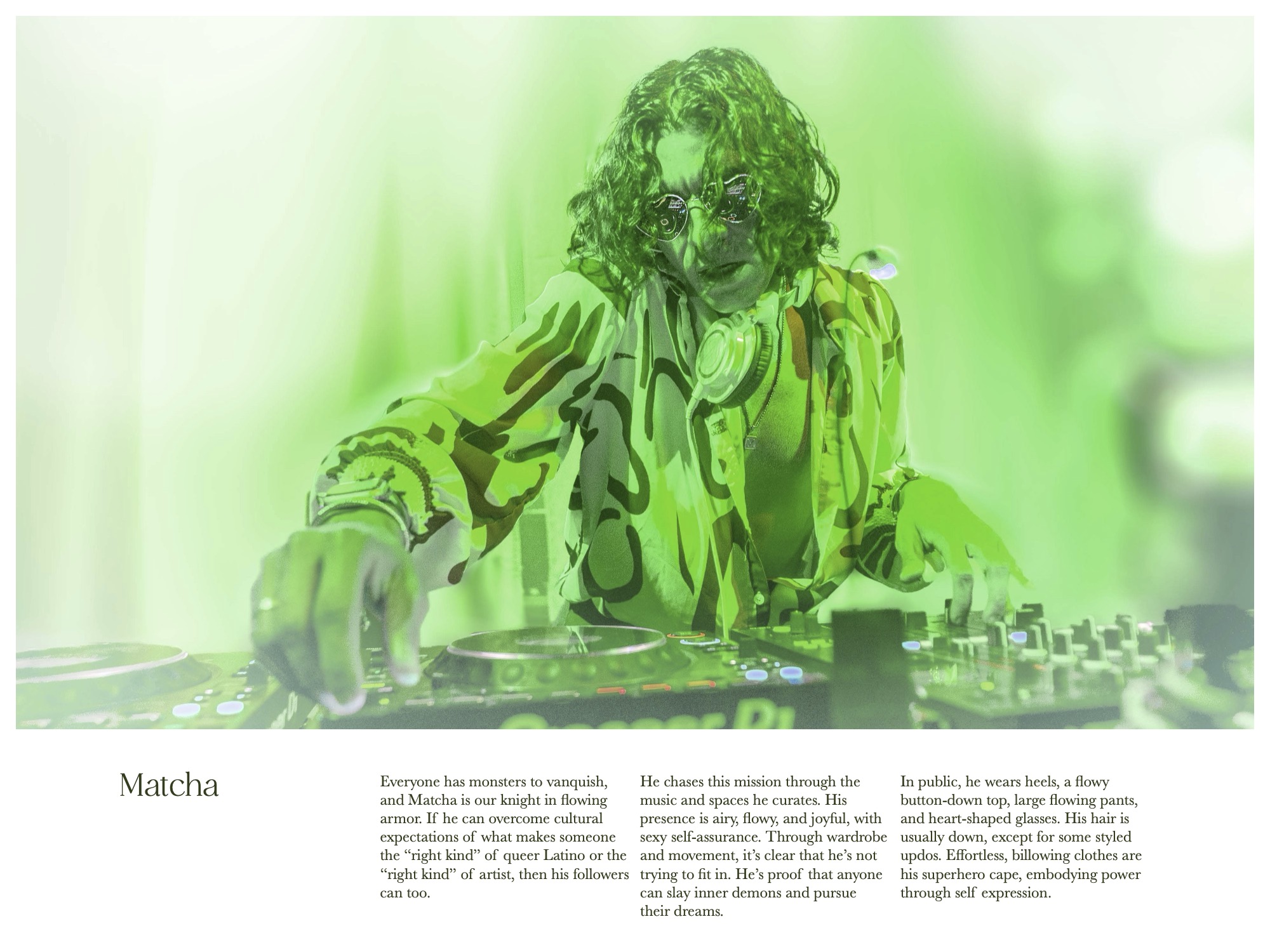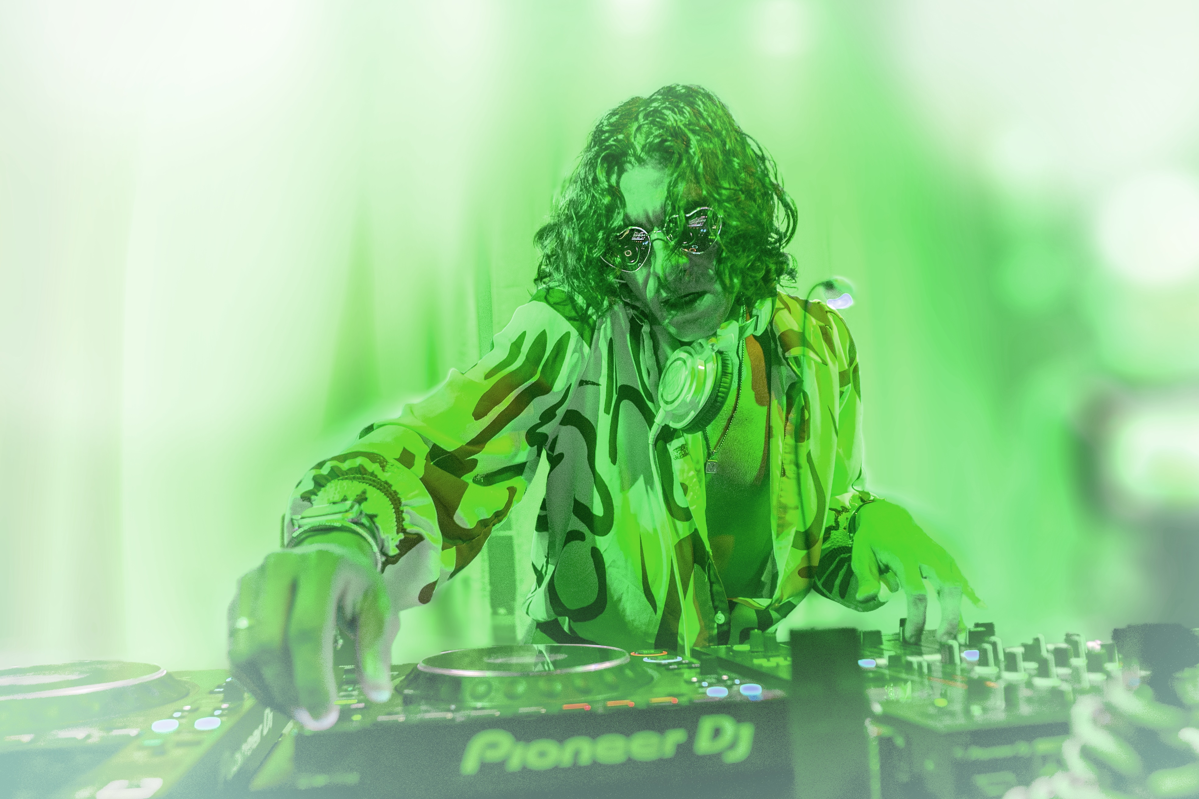
DJ Match.a.mor, or simply “Matcha,” needed a brand refresh at a time of massive growth in his career. He knew it was time to create a suave and sexy brand that could grow with him. We crafted a story with Matcha at its center, a knight in flowing armor, here to slay his demons. With this story to guide us, we refined every detail. wardrobe, social media content, color schemes, and unique collectible merch work together to create Matcha’s universe.
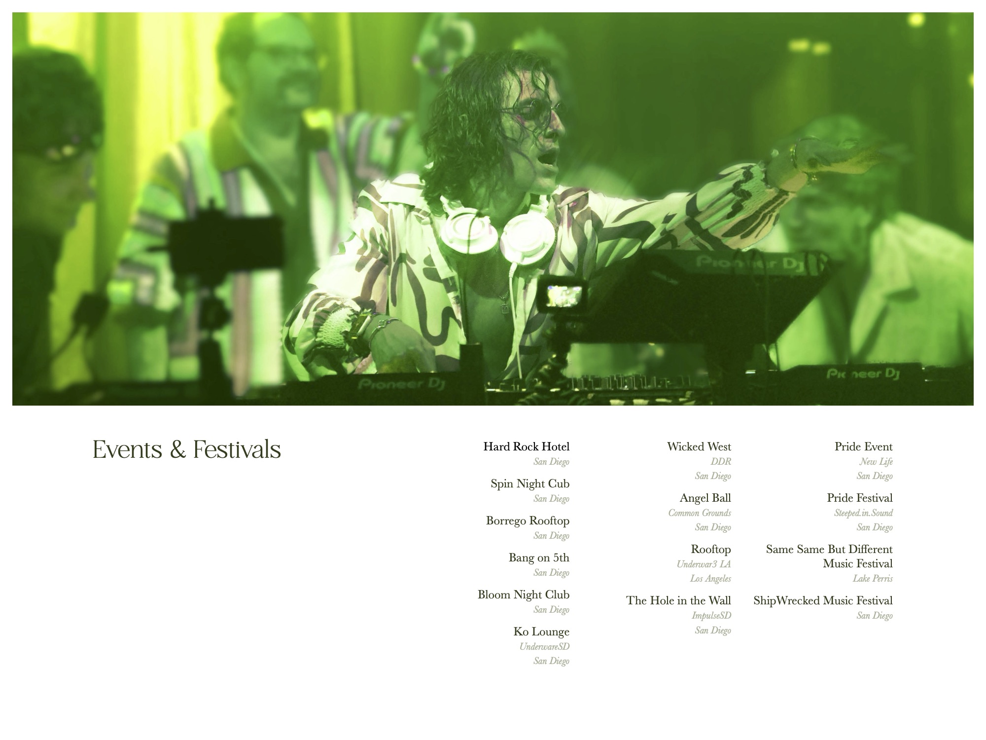
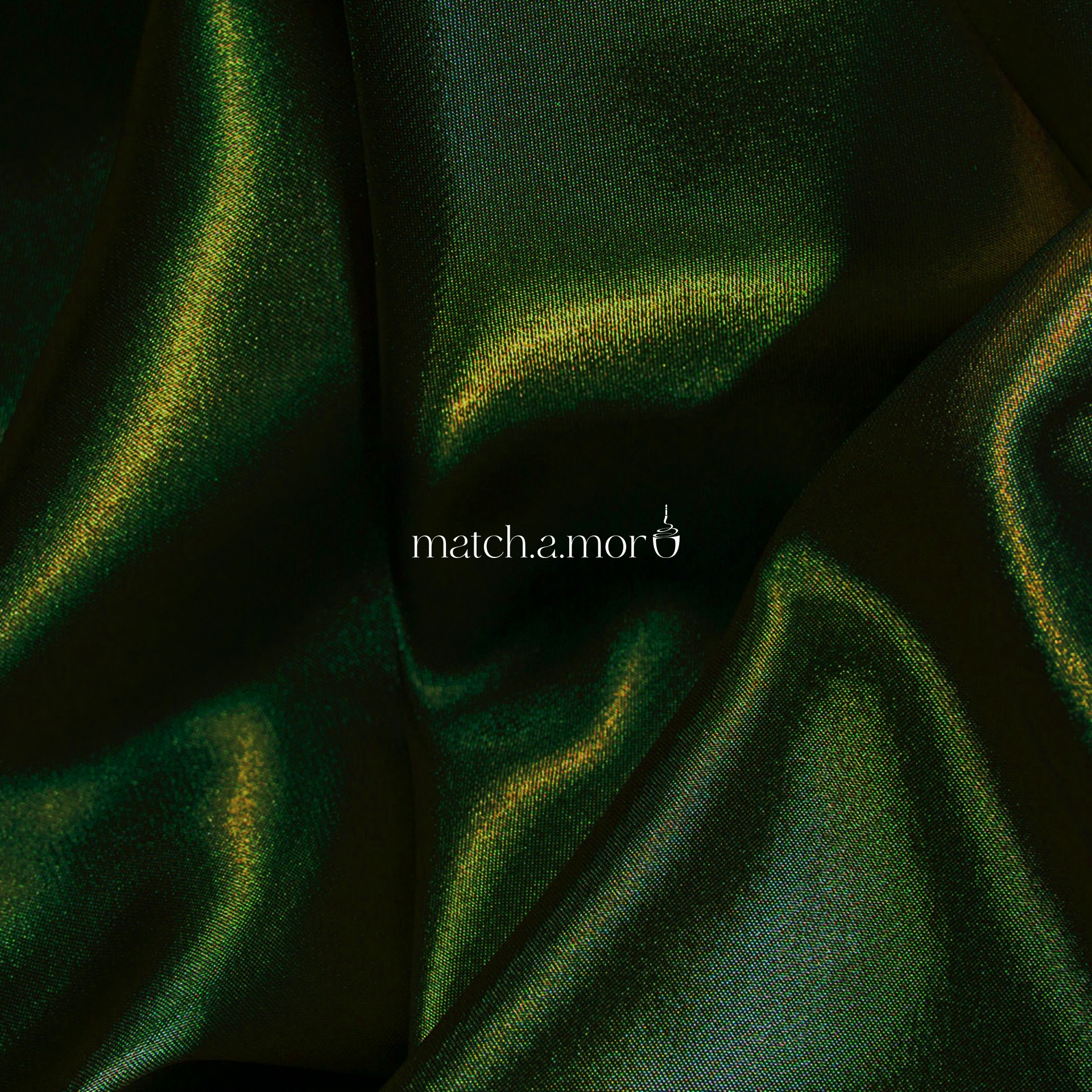
The EDM scene loves off-balance layouts, which create life and energy. And there are parallels in luxury packaging, which favors pared-down color palettes and a healthy amount of negative space. Photo treatments create a tight color scheme and a dreamy, blooming atmosphere.
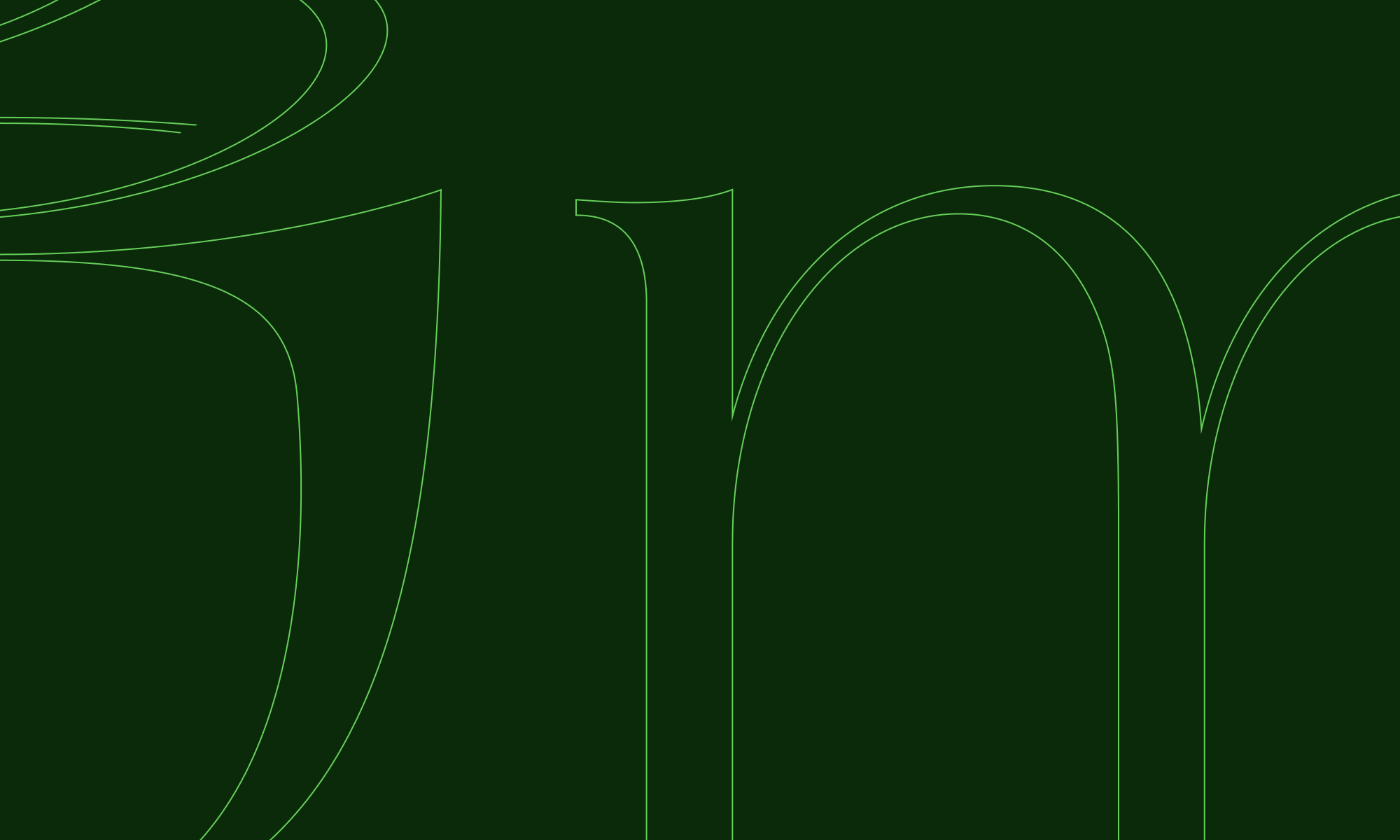
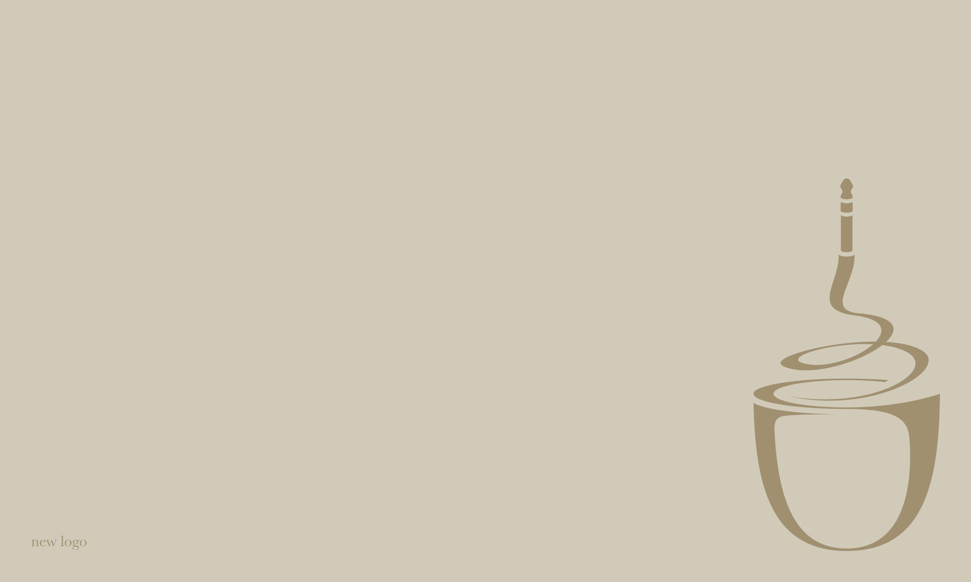
Matcha loved his teacup logo, and wanted a more polished version. The new logo pulls forms directly from Ethereal Thin, mimicking its high-contrast swoops. The two sit perfectly side by side.
The most crucial marketing collateral for a DJ is their press kit. But existing examples of press kits were stuck in the mid 2010s — dated, but not dated enough to feel nostalgic. We approached the format with fresh eyes, keeping it minimal, clear, and true to the Match.a.mor brand.