HV Entertainment approached me to lead the design of their newest venture: a bar that doubles as a cocktail lounge in the evening (The Belmont) and a nightclub after dark (Decibel).
The client gravitated to classic Chicago, art-deco aesthetics for The Belmont, but Decibel needed something geared towards audiophiles. To connect the two brands, I told the story of two Chicago revolutions: The Belmont draws on Chicago’s history as a printing powerhouse, and Decibel draws on the birth of house music.
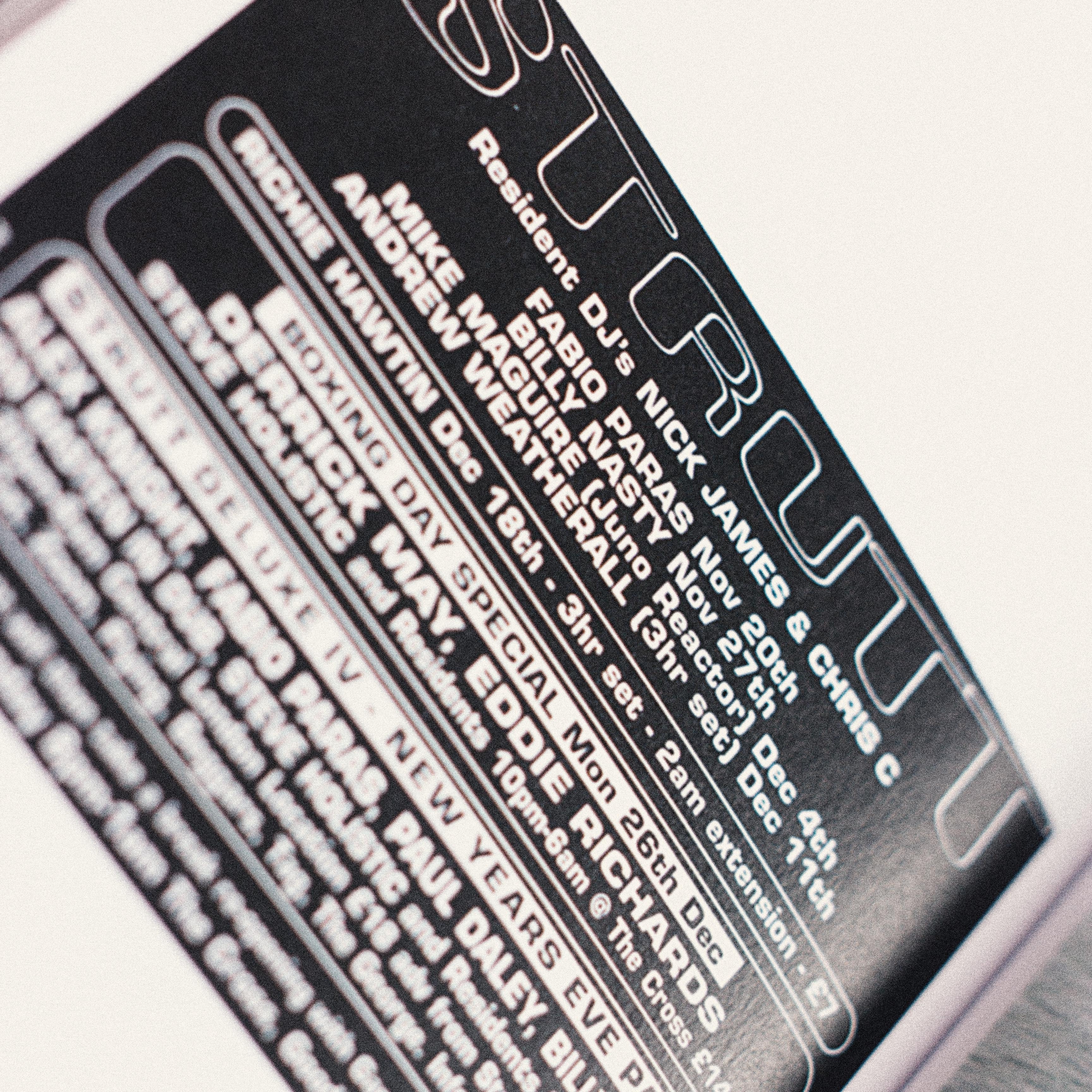
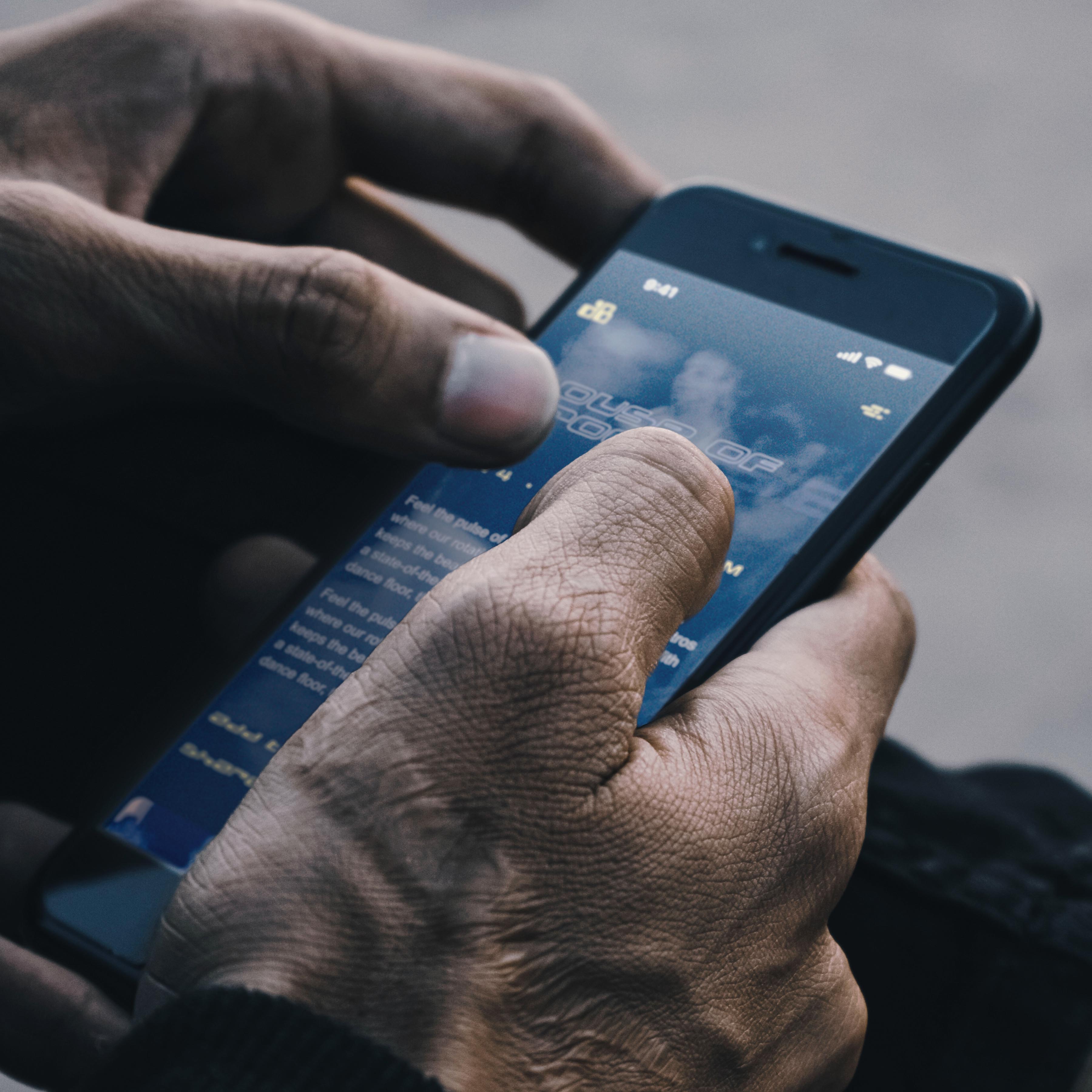
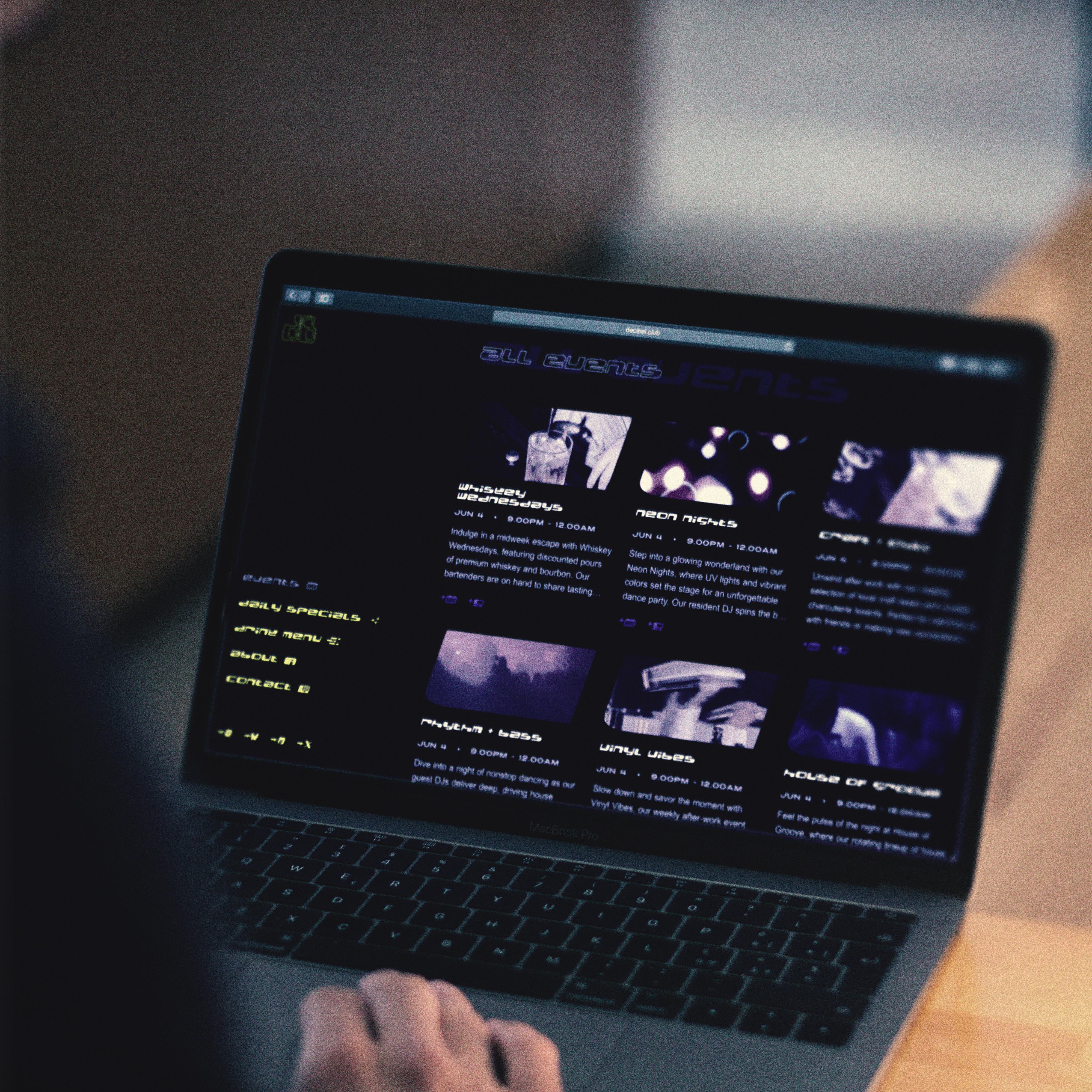
I looked at flyers, zines, album artwork, and other printed matter from the early house scene. This time period coincided with the Internet’s rise, which ushered in an era of experimental Flash web design. The overall effect is a techno-optimism that’s distinctly 90s, before corporate giants enclosed the web. Decibel sits in this era of possibility and idiosyncrasy.
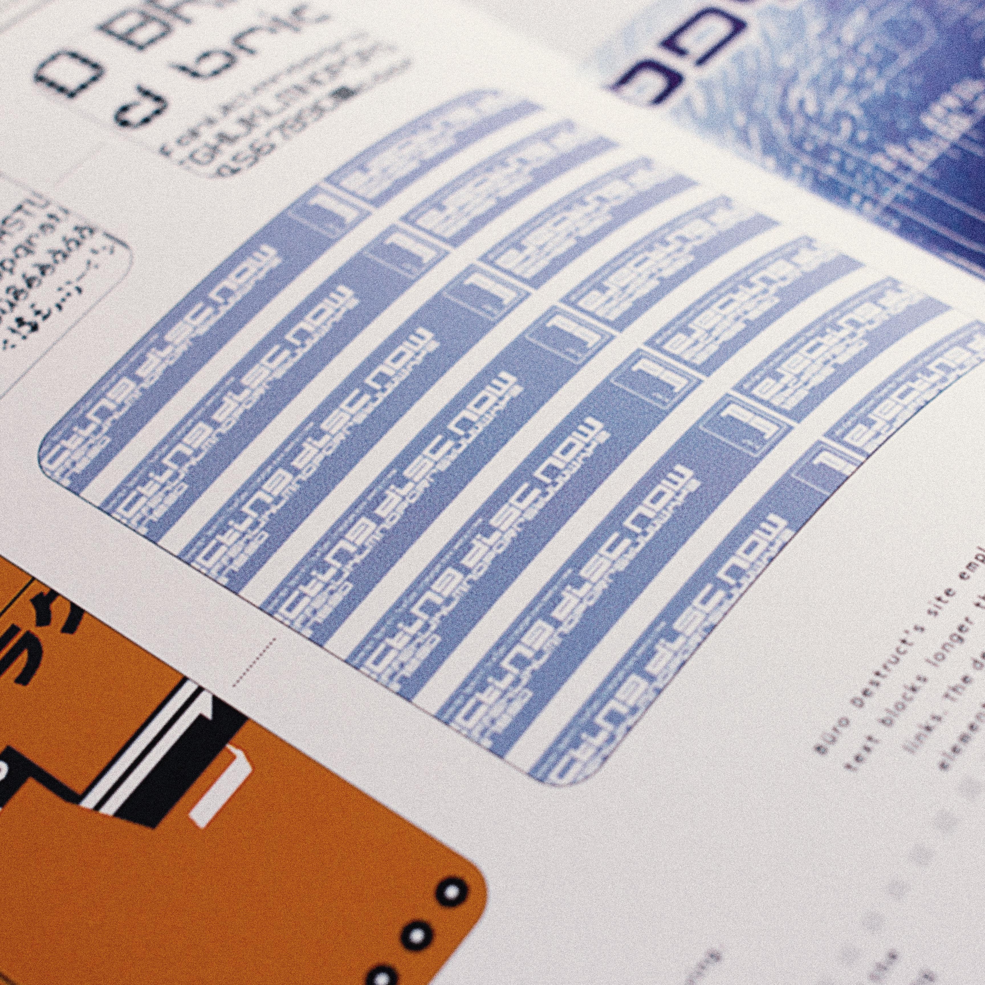
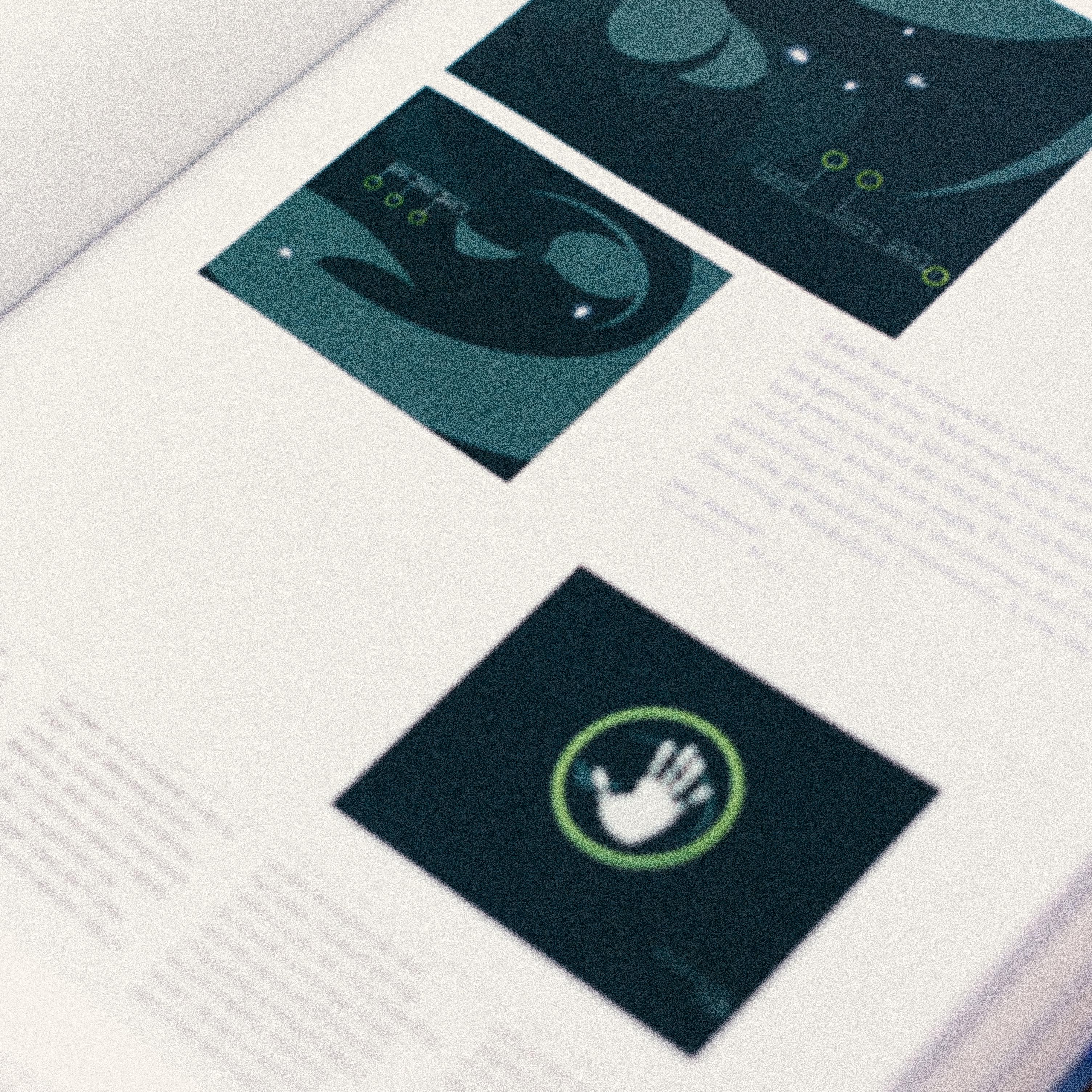
Bürodestruct’s BD Geminis (2003) and BD Electrobazaar (1995) capture the house music scene's aesthetic, a nod to the club's target audience. Tempo (1938), a typeface from Chicago’s own Ludlow Typograph Co., ties in with The Belmont. Electrobazaar’s curves and slant inspired a range of custom icons.
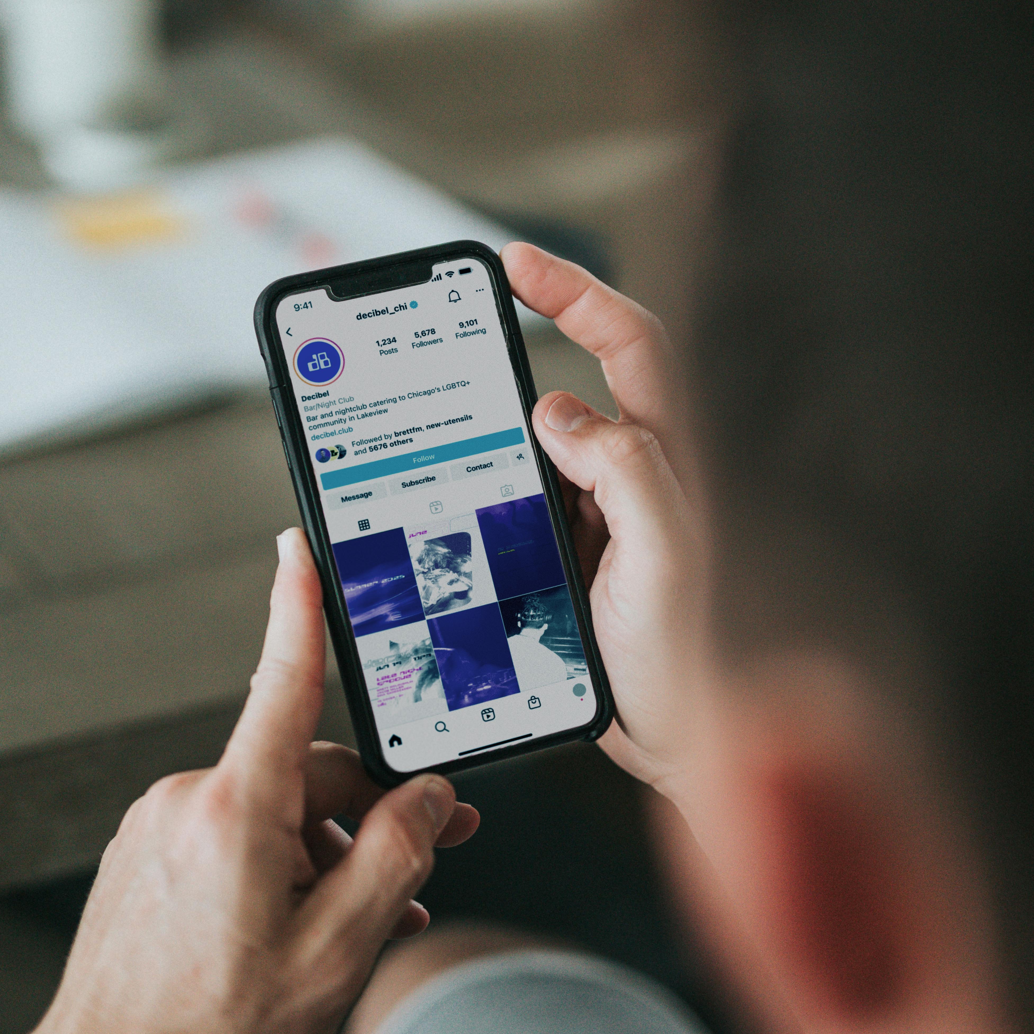
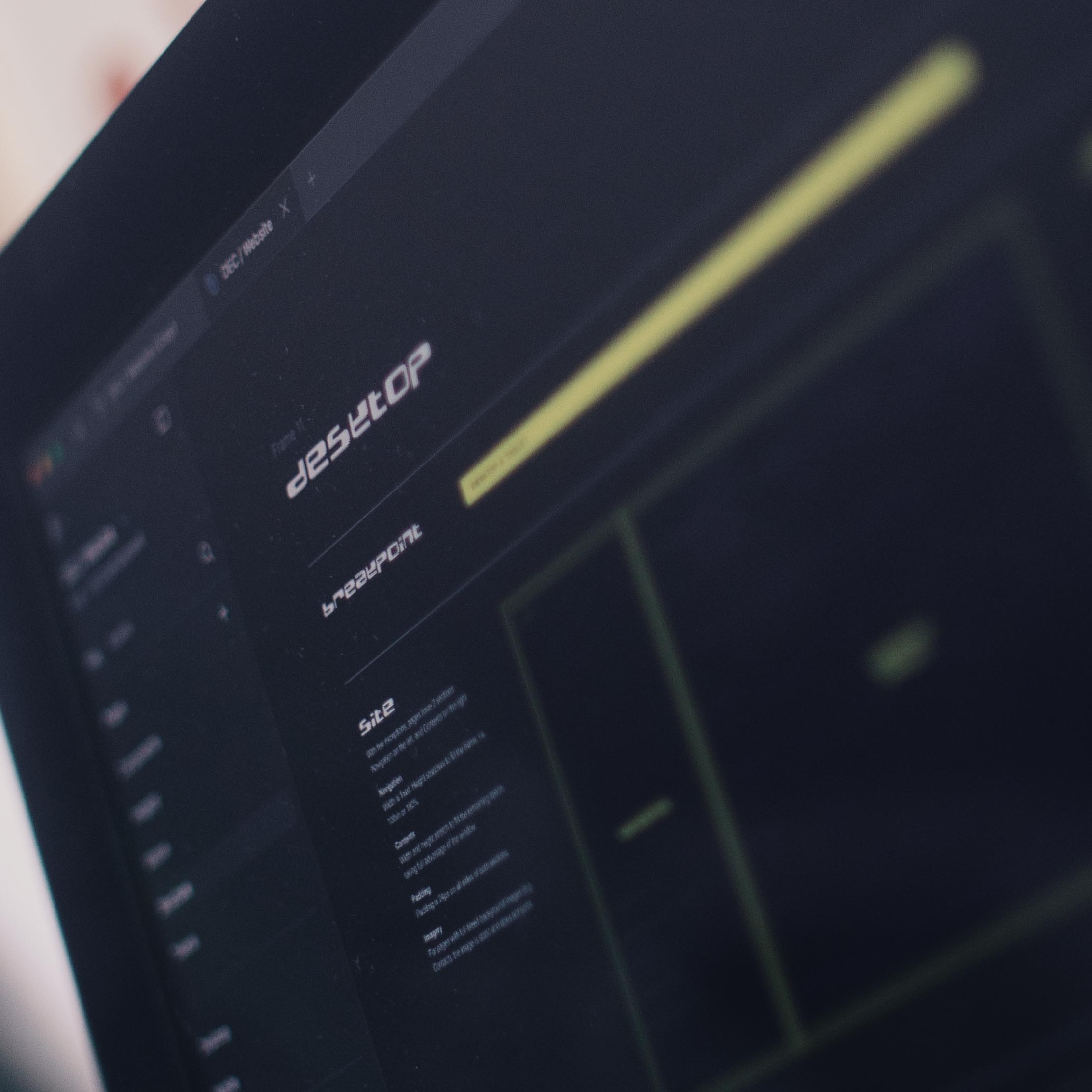
The website needed the right balance of 20th-century quirk and 21st-century gloss — and robust documentation for execution. And unlike the Flash sites killed off by the mobile revolution, this site is mobile-friendly. Curved forms and slanted motifs are pulled directly from BD Electrobazaar, giving the whole site momentum and unity.
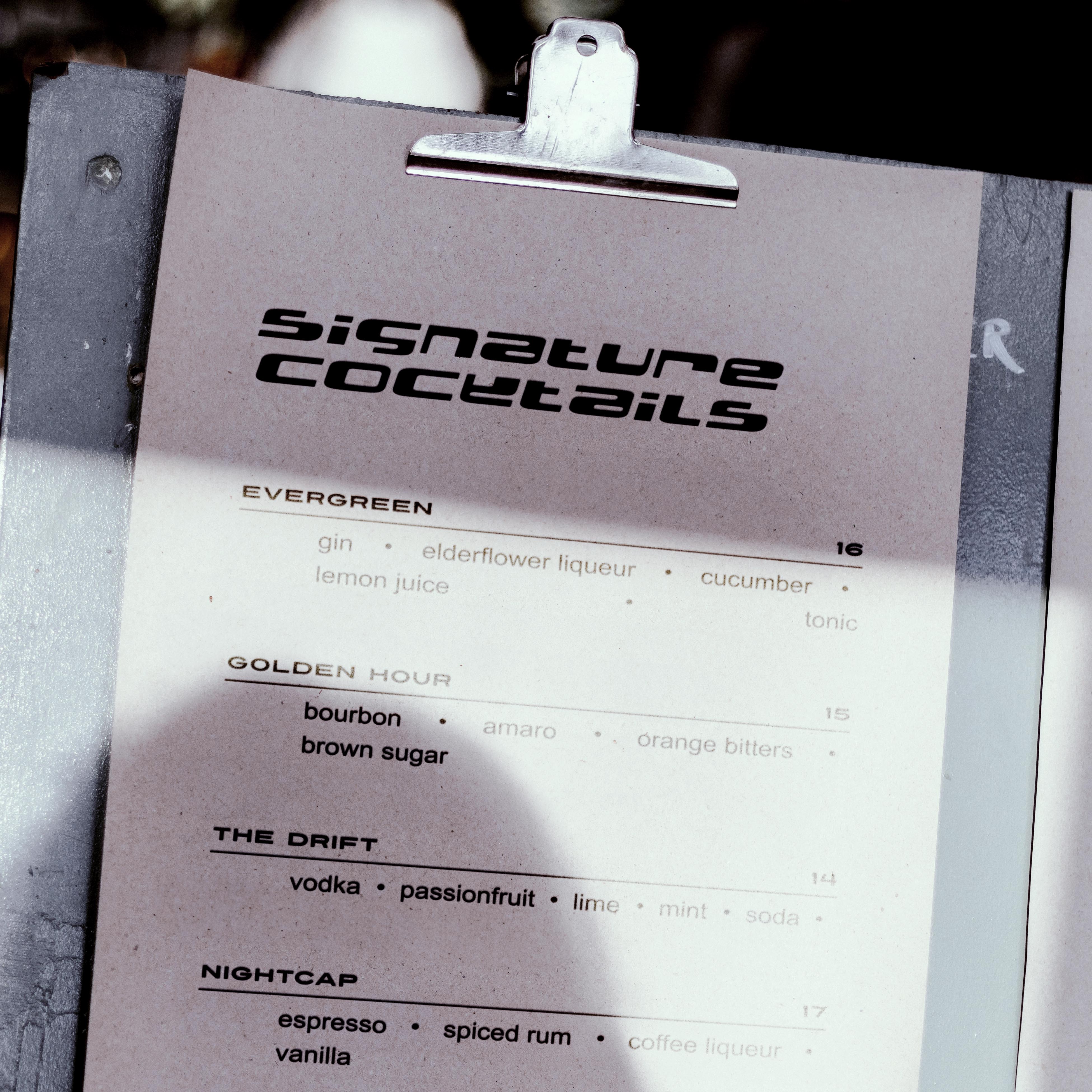
Chicago house aesthetics take center stage in Decibel’s printed matter and marketing collateral. Slanted layouts, jagged indentation, and minimal color schemes are fearless and embrace the aesthetics of handmade flyers.